diff options
Diffstat (limited to 'source/blog/2015-08-31-after-all-these-years-10pt-non-anti-aliased-monaco-is-still-the-best.md')
| -rw-r--r-- | source/blog/2015-08-31-after-all-these-years-10pt-non-anti-aliased-monaco-is-still-the-best.md | 19 |
1 files changed, 0 insertions, 19 deletions
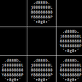
diff --git a/source/blog/2015-08-31-after-all-these-years-10pt-non-anti-aliased-monaco-is-still-the-best.md b/source/blog/2015-08-31-after-all-these-years-10pt-non-anti-aliased-monaco-is-still-the-best.md deleted file mode 100644 index 2d5a74f9..00000000 --- a/source/blog/2015-08-31-after-all-these-years-10pt-non-anti-aliased-monaco-is-still-the-best.md +++ /dev/null @@ -1,19 +0,0 @@ ---- -title: "After all these years, 10pt non-anti-aliased Monaco is still the best" -date: 2015-08-31T06:31:03+08:00 -date_display: August 31, 2015 ---- - -Ars Technica [just ran a piece](http://arstechnica.com/information-technology/2015/08/open-source-typeface-hack-brings-design-to-source-code/) on the open source programming font [Hack](https://github.com/chrissimpkins/Hack). Now I don't really know why this is news-worthy (open source programming fonts aren't a new thing), but I thought I'd give it a try. - -The result is unsurprising. I've loved my 10pt non-anti-aliased Monaco for years, beginning with the Pro profile of Terminal.app. In fact, I initially refused to use iTerm2 precisely because I can't reproduce my beloved typeface in it, until I found out the non anti-aliasing trick. This time again, Hack simply can't compete with my favorite font; see the screenshots below. Among other things, it is way too thick for my liking — the same problem that haunts a whole range of programming fonts. Note that Hack is [supposed to](https://github.com/chrissimpkins/Hack#about) look good at 8px–12px according to its README, but I tested it at 9pt–12pt in iTerm2 (I know, pt is supposed to be larger than px, but I seriously doubt that anyone would want 8px or 6pt as their daily font size — and for that matter iTerm2 doesn't even allow me to go below 9pt, a pretty reasonable restriction, I'd say). - -By the way, it is worth pointing out that the very same Monaco looks horrible at 9pt or 11pt, anti-aliased or not (same goes for 10pt anti-aliased). 10pt non-anti-aliased Monaco is simply a miracle. - -**09/01/2015 update:** Looks like I was quite confused about pt and px, and they are to be used interchangeably in the current context. I suggest that anyone interested in this subject also read John Gruber's two very informative pieces from 2003, [*Anti-Aliasing*](http://daringfireball.net/2003/03/antialiasing.html) and [*Anti-Anti-Aliasing*](https://daringfireball.net/2003/03/anti-anti-aliasing). - - - - - - |
